2.5 Months In: What My AR Thesis Looks Like Today
2.5 Months In: What My AR Thesis Looks Like Today
This post is an honest progress update. No results yet, no conclusions. What I have is a confirmed direction, a prototype in active development, a study scheduled for May, and a clearer picture of what doing research actually involves than I had when I started at the beginning of the year. Here is where things stand.
This post is an honest progress update. No results yet, no conclusions. What I have is a confirmed direction, a prototype in active development, a study scheduled for May, and a clearer picture of what doing research actually involves than I had when I started at the beginning of the year. Here is where things stand.

What Is Confirmed and Settled
The Research Question
The question is finalised: to what extent does a head-worn AR shopping assistant displaying wayfinding cues, contextual product information, and quick-comparison overlays improve task performance, usability, and cognitive workload in grocery shopping, compared to unassisted shopping with natural phone use?
The Gap
The gap this question addresses is documented, not asserted. Qiu, Mostafavi and Kalantari's 2025 systematic review of 88 AR wayfinding studies found zero situated in retail or grocery environments. Wolniak, Stecuła and Aydın's 2024 review of grocery digital transformation states explicitly that AR in grocery has not been studied in the academic field. The closest existing work addresses fragments in isolation: wayfinding without product information, product information without navigation, comparison without a complete shopping workflow. Posts 4 and 5 in this series cover the full gap mapping.
The Study Design
Within-subjects. 16 to 20 participants. Meta Quest 3 versus unassisted shopping with natural phone use. A six-item shopping task with two comparison sub-tasks. SUS and Raw NASA-TLX across all six subscales. Semi-structured post-task interviews and observer notes. Sessions of approximately 65 minutes, counterbalanced for condition order. Post 6 covers the methodological reasoning in full.
Phase 1: Requirements Survey
Complete. Twenty regular grocery shoppers were surveyed in March 2026. Their responses shaped three specific design decisions in the prototype:
Product information overlays activate on proximity rather than displaying persistently, because 12 of 20 respondents flagged clutter control as very important
The feature set centres on navigation and information rather than social or recommendation features
The baseline is unassisted shopping with natural phone access, because 10 of 20 respondents said that is how they currently shop
What Is Being Built Right Now
The prototype runs on Meta Quest 3 in video pass-through mode, developed in Unity 6. The physical store environment is a mapped lab space with real shelves stocked with real grocery products. Participants will physically walk through the space, seeing the real environment through the Quest 3 passthrough camera with AR overlays composited on top.
Navigation System
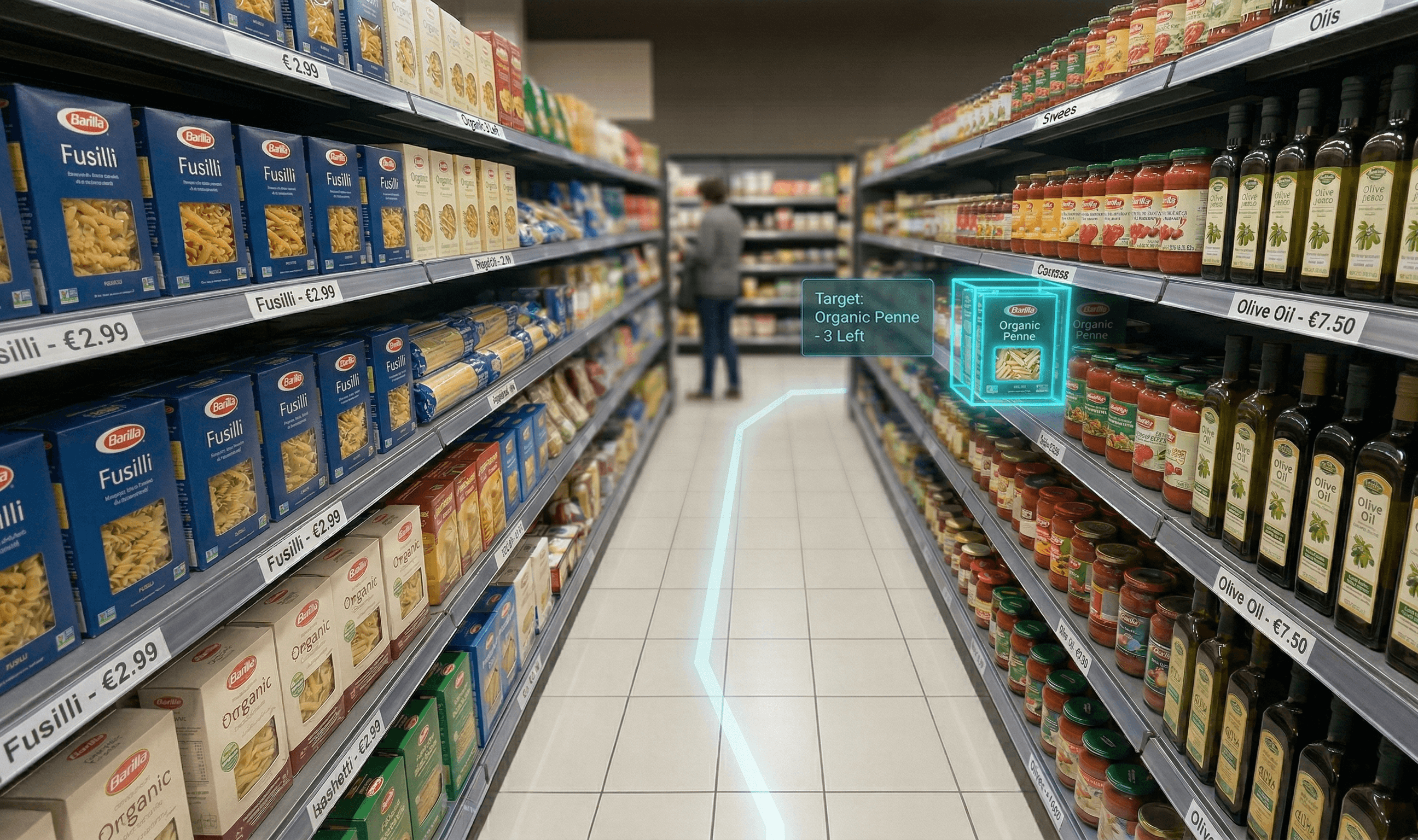
The most technically involved component and the current development focus. It uses Meta's MRUK for room scanning and floor mesh generation, NavMesh path calculation for routing, and a LineRenderer for the floor path visual.
The design decision to use a floor path rather than floating arrows or a minimap is informed by the wayfinding literature: floor paths keep the user's gaze at ground level and ahead, reducing the head-down attention split that Neeson et al. (2025) identified as the mechanism behind smartphone AR performing worse than no aid at all.
When the user reaches the correct shelf area, the target product is visually highlighted to distinguish it from surrounding products. This separation between routing (getting to the right aisle) and identification (finding the right item on a dense shelf) is a design decision that does not appear in building navigation studies and is one of the features I am most interested to evaluate.
Product Information Overlays
Implemented as world-space Canvas elements in Unity, anchored to shelf positions and activated by proximity. The on-demand activation is grounded in Hoffmann, Joerß, Mai and Akbar's (2022) finding that giving users too much control over AR information disclosure can backfire, and in Warden and colleagues' (2025) evidence that persistent overlays on visually complex backgrounds create measurable clutter costs.
Quick-Comparison Overlay
The feature furthest from completion. The design challenge is showing differentiating attributes for two or three products side by side on a shelf without producing the visual clutter the rest of the interface is designed to avoid. Early work is informed by ARShopping (Xu et al., 2022) and the Álvarez Márquez and Ziegler (2023) comparison interface research.
The Known Risks and How They Are Being Handled
No study runs without problems. Five specific risks are being monitored going into the pilot phase.
Quest 3 passthrough quality at close range. Reading product label text through a camera feed at typical shelf-reading distance is a known constraint of video see-through displays. The pilot will test all labels and overlays for readability. High-contrast large-font labels are the fallback.
Lab space navigation range. If the available space is insufficient for a full multi-aisle layout, the fallback is a focused four to six shelf section that preserves the compound task structure while fitting the area.
Novelty effect contamination. Participants in the AR condition may report higher satisfaction partly because the technology is new rather than because it is genuinely useful. Condition order counterbalancing reduces this risk. The post-study interview includes a question explicitly distinguishing novelty excitement from perceived utility.
Participant unfamiliarity with the Quest 3. Three minutes of familiarisation time before each condition is built into the session protocol. Prior AR experience is recorded as a covariate so that any unfamiliarity effect can be examined in the analysis rather than treated as noise.
Null or negative results. If the AR system is slower, produces higher workload, or scores lower on usability than unassisted shopping, that finding is equally valid. The first HCI benchmark for this application context is useful regardless of which direction the evidence points. Planning for null results means the discussion section is thought through in advance rather than improvised when the data arrives.
What This Process Has Taught Me
I have spent eight years designing products. I know how to move from problem to concept to prototype to test. That process and the process of building a research study look similar from a distance and are quite different up close.
In design work, a decision is good if it serves the user and fits the constraints. Justification is internal: does this work for the problem? In research, every decision has to be justifiable to someone who did not make it, using evidence that exists independently of the project. Not "this seemed right" but "this is what the literature supports, this is what prior studies found, and this is why the alternative choices were rejected."
That standard is slower. It forces you to read more carefully, to understand why things were done the way they were before you decide to do them differently, and to be honest about the limits of what your own study can claim.
The most useful thing I have learned in 2.5 months of active work is that being specific is a form of honesty. The original proposal was vague in ways that felt like flexibility but were actually evasion. The revised proposal is specific about what it studies, what it does not study, what the risks are, and what the results will and will not tell us. That specificity is not a constraint on the work. It is what makes the work credible.
What Comes Next
The pilot test runs first, to surface everything the design phase could not anticipate. The main user study runs in May. Data collection, analysis, and writing follow through the summer.
The next posts in this series will document what the study actually produced: what participants did, what they said, where the AR interface helped and where it did not, whether the theoretical predictions held, and what the data looked like before and after the complications that every user study encounters.
If you are following this because you are working on something similar, designing with AR, studying HCI, or trying to figure out how to turn a project into a research contribution, the messier parts of this process are the parts I plan to document most carefully.
The moments where a decision turns out to be wrong. Where the pilot reveals something the design assumed away. Where the data says something unexpected.
You can have the review of the Proposal here https://mseymur.framer.website/masters-proposal
That is where the learning is. It is also the part most thesis blogs skip.
What Is Confirmed and Settled
The Research Question
The question is finalised: to what extent does a head-worn AR shopping assistant displaying wayfinding cues, contextual product information, and quick-comparison overlays improve task performance, usability, and cognitive workload in grocery shopping, compared to unassisted shopping with natural phone use?
The Gap
The gap this question addresses is documented, not asserted. Qiu, Mostafavi and Kalantari's 2025 systematic review of 88 AR wayfinding studies found zero situated in retail or grocery environments. Wolniak, Stecuła and Aydın's 2024 review of grocery digital transformation states explicitly that AR in grocery has not been studied in the academic field. The closest existing work addresses fragments in isolation: wayfinding without product information, product information without navigation, comparison without a complete shopping workflow. Posts 4 and 5 in this series cover the full gap mapping.
The Study Design
Within-subjects. 16 to 20 participants. Meta Quest 3 versus unassisted shopping with natural phone use. A six-item shopping task with two comparison sub-tasks. SUS and Raw NASA-TLX across all six subscales. Semi-structured post-task interviews and observer notes. Sessions of approximately 65 minutes, counterbalanced for condition order. Post 6 covers the methodological reasoning in full.
Phase 1: Requirements Survey
Complete. Twenty regular grocery shoppers were surveyed in March 2026. Their responses shaped three specific design decisions in the prototype:
Product information overlays activate on proximity rather than displaying persistently, because 12 of 20 respondents flagged clutter control as very important
The feature set centres on navigation and information rather than social or recommendation features
The baseline is unassisted shopping with natural phone access, because 10 of 20 respondents said that is how they currently shop
What Is Being Built Right Now
The prototype runs on Meta Quest 3 in video pass-through mode, developed in Unity 6. The physical store environment is a mapped lab space with real shelves stocked with real grocery products. Participants will physically walk through the space, seeing the real environment through the Quest 3 passthrough camera with AR overlays composited on top.
Navigation System
The most technically involved component and the current development focus. It uses Meta's MRUK for room scanning and floor mesh generation, NavMesh path calculation for routing, and a LineRenderer for the floor path visual.
The design decision to use a floor path rather than floating arrows or a minimap is informed by the wayfinding literature: floor paths keep the user's gaze at ground level and ahead, reducing the head-down attention split that Neeson et al. (2025) identified as the mechanism behind smartphone AR performing worse than no aid at all.
When the user reaches the correct shelf area, the target product is visually highlighted to distinguish it from surrounding products. This separation between routing (getting to the right aisle) and identification (finding the right item on a dense shelf) is a design decision that does not appear in building navigation studies and is one of the features I am most interested to evaluate.
Product Information Overlays
Implemented as world-space Canvas elements in Unity, anchored to shelf positions and activated by proximity. The on-demand activation is grounded in Hoffmann, Joerß, Mai and Akbar's (2022) finding that giving users too much control over AR information disclosure can backfire, and in Warden and colleagues' (2025) evidence that persistent overlays on visually complex backgrounds create measurable clutter costs.
Quick-Comparison Overlay
The feature furthest from completion. The design challenge is showing differentiating attributes for two or three products side by side on a shelf without producing the visual clutter the rest of the interface is designed to avoid. Early work is informed by ARShopping (Xu et al., 2022) and the Álvarez Márquez and Ziegler (2023) comparison interface research.
The Known Risks and How They Are Being Handled
No study runs without problems. Five specific risks are being monitored going into the pilot phase.
Quest 3 passthrough quality at close range. Reading product label text through a camera feed at typical shelf-reading distance is a known constraint of video see-through displays. The pilot will test all labels and overlays for readability. High-contrast large-font labels are the fallback.
Lab space navigation range. If the available space is insufficient for a full multi-aisle layout, the fallback is a focused four to six shelf section that preserves the compound task structure while fitting the area.
Novelty effect contamination. Participants in the AR condition may report higher satisfaction partly because the technology is new rather than because it is genuinely useful. Condition order counterbalancing reduces this risk. The post-study interview includes a question explicitly distinguishing novelty excitement from perceived utility.
Participant unfamiliarity with the Quest 3. Three minutes of familiarisation time before each condition is built into the session protocol. Prior AR experience is recorded as a covariate so that any unfamiliarity effect can be examined in the analysis rather than treated as noise.
Null or negative results. If the AR system is slower, produces higher workload, or scores lower on usability than unassisted shopping, that finding is equally valid. The first HCI benchmark for this application context is useful regardless of which direction the evidence points. Planning for null results means the discussion section is thought through in advance rather than improvised when the data arrives.
What This Process Has Taught Me
I have spent eight years designing products. I know how to move from problem to concept to prototype to test. That process and the process of building a research study look similar from a distance and are quite different up close.
In design work, a decision is good if it serves the user and fits the constraints. Justification is internal: does this work for the problem? In research, every decision has to be justifiable to someone who did not make it, using evidence that exists independently of the project. Not "this seemed right" but "this is what the literature supports, this is what prior studies found, and this is why the alternative choices were rejected."
That standard is slower. It forces you to read more carefully, to understand why things were done the way they were before you decide to do them differently, and to be honest about the limits of what your own study can claim.
The most useful thing I have learned in 2.5 months of active work is that being specific is a form of honesty. The original proposal was vague in ways that felt like flexibility but were actually evasion. The revised proposal is specific about what it studies, what it does not study, what the risks are, and what the results will and will not tell us. That specificity is not a constraint on the work. It is what makes the work credible.
What Comes Next
The pilot test runs first, to surface everything the design phase could not anticipate. The main user study runs in May. Data collection, analysis, and writing follow through the summer.
The next posts in this series will document what the study actually produced: what participants did, what they said, where the AR interface helped and where it did not, whether the theoretical predictions held, and what the data looked like before and after the complications that every user study encounters.
If you are following this because you are working on something similar, designing with AR, studying HCI, or trying to figure out how to turn a project into a research contribution, the messier parts of this process are the parts I plan to document most carefully.
The moments where a decision turns out to be wrong. Where the pilot reveals something the design assumed away. Where the data says something unexpected.
You can have the review of the Proposal here https://mseymur.framer.website/masters-proposal
That is where the learning is. It is also the part most thesis blogs skip.